SaaS Product Design
Tech Travel App
UX/UI Design | Brand Identity | Investor Pitch Deck
The Situation
A travel tech startup needed more than a product design — they needed to know who they were building for and why anyone would choose them. I came in at the brand strategy layer: defining the audience, the positioning, and the voice before a single screen was finalized.
How I Thought About It
Travel apps don't fail because the UX is bad. They fail because nobody can explain in one sentence why this one and not the other ten. That's a brand problem. So before wireframes, we figured out the story. Who is this actually for? What do they believe about travel that nobody else is saying? What does this product need to feel like to earn their trust immediately?
The design work came after that. Every interface decision was filtered through the brand brief we built first.
What I Built
- Defined target audience and developed buyer personas
- Built brand positioning and voice guidelines
- Translated brand strategy into UX direction and visual language
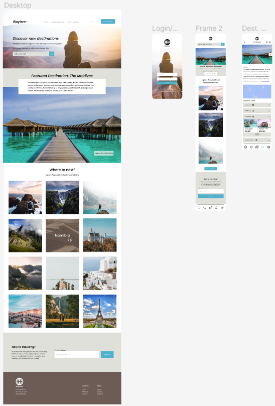
- Produced high-fidelity prototype informed by brand brief
- Delivered full brand system from concept through prototype
High-Fidelity Prototype
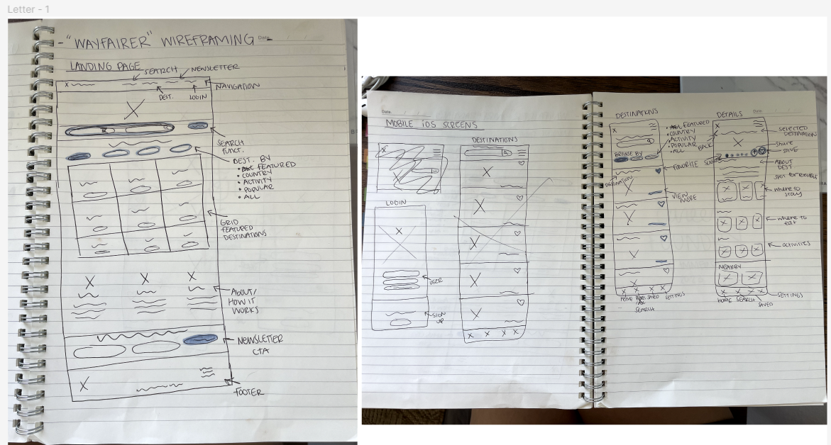
UX Process
Results